Design that get’s under the skin of your needs
A focused, inclusive design approach and delivery for web and print
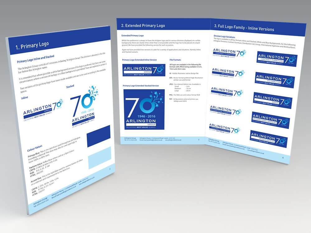

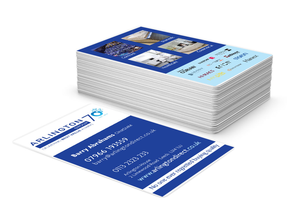
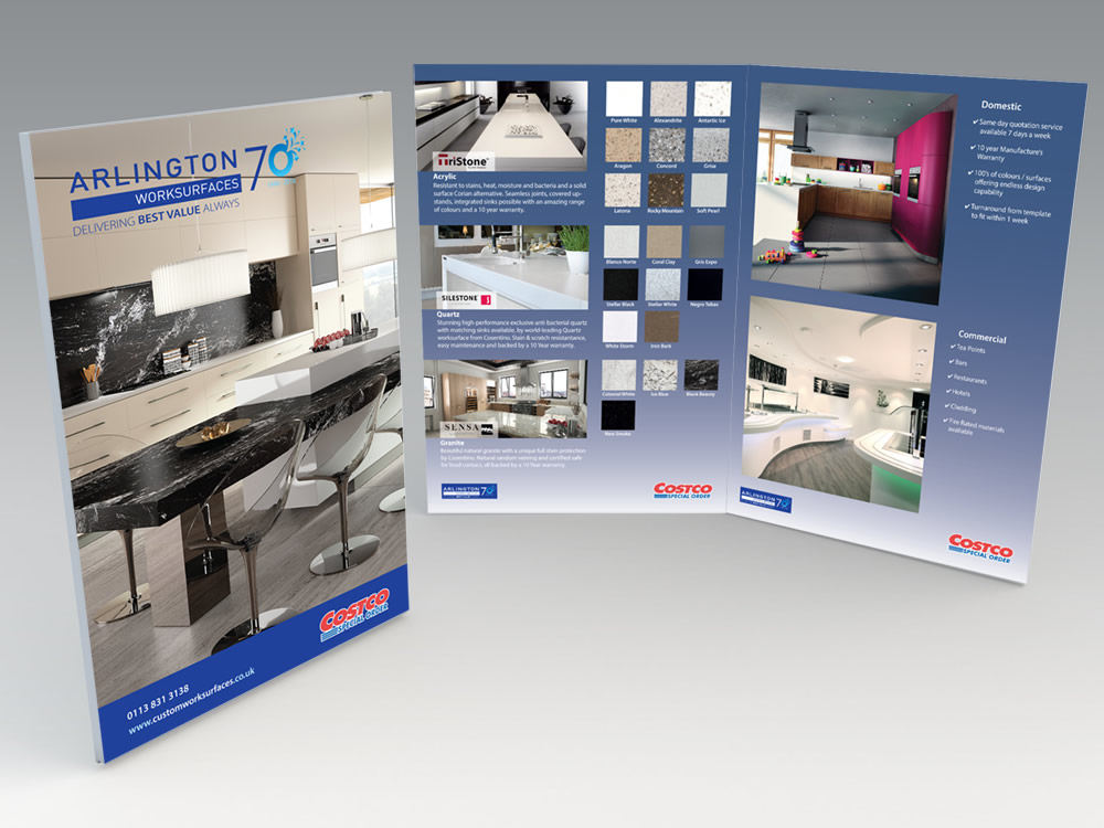
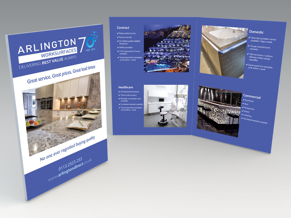
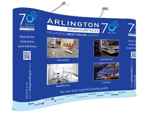
Arlington Group Rebrand and Repositioning
There’s nothing like an anniversary to bring an organisation together to celebrate and showcase their longevity and ability to service their clients over a sustained period of time.
This was our starting point when Arlington Group asked us to discuss their forthcoming 70th anniversary.
An opportunity full of joy and good news, and a chance to showcase their business as its best.
Client:
Barry Abrahams
Location:
Leeds
Skills:
- Brand Repositioning
- Logo Family Development
- Brand Guideline
- Corporate/Promotional Materials
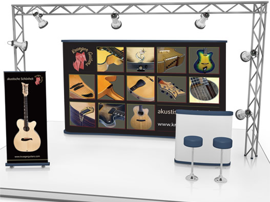
- Exhibition Graphics
- Corporate Stationery
Approach
Arlington Group consists of a number of sub divisions all with their own recognised sub brands.
As such the task here was to reposition and build upon the existing brand to accommodate the forthcoming 70th anniversary, whilst maintaining the core of the brand and its values
Solution
The focus on the 70th became the key visual factor when bring in the repositioning element.
We also introduced a second contrast colour blue to provide for some variation and development within the brand.
A complete set of brand collateral, materials and resources were created and supplied allowing for seamless brand application across all sectors and requirements both in print and
Results
The repositioned logo has a life cycle of 5 years at which point a 75th anniversary is pending.
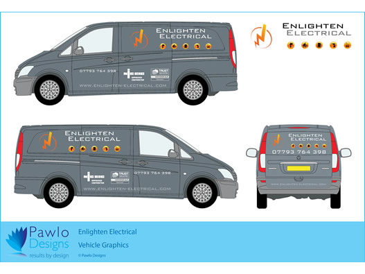
To date the brand has been rolled out across all branding collateral including, print, online, vehicles and signage exhibition stands and all