Design that get’s under the skin of your needs
A focused, inclusive design approach and delivery for web and print


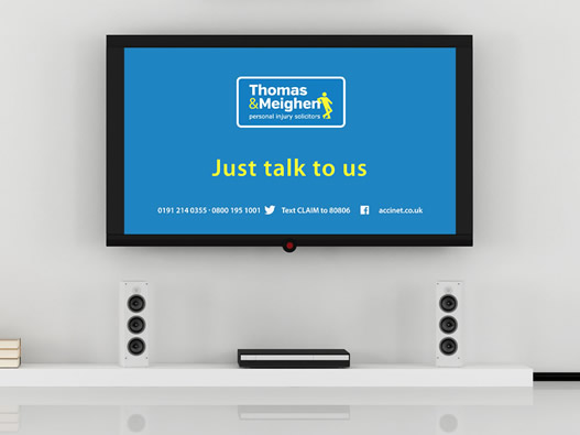
TV Commercial Graphics
We often work in collaboration with our media partners in order to help bring together a multi-platform design. Our work on the Thomas and Meighen (T&M) television advert is one such example.
Our Video production partners Silversun Media Group asked us to create some visuals and graphics to help take their client forward. T&M had worked hard to develop their regional presence and market and now wanted to lift their position so that it looked more national and larger as its business had grown.
Our task was to take their brand, build on it and introduce some more visual sophistication and dynamics into its on screen language, mixing live action with screen animation and illustration of their offer and service.
-
Partner:
Silversun Media Group
Client:
Thomas & Meighen
Skills:
- Illustration and Icon Design
- Sceen Animation Graphics
Approach
In discussion with our partners we identified the need to provide an interactive form of screen animation to help deliver their message in a more modern message.
This would employ a simple and reusable motif to provide;
¥ the wider service offer ¥ as well as the targetted service that would feature in each individual advert.
We also wished to reinforce the brand and extend the use of the stick figure character that is used within the logo.
The animation would clearly need to work seamlessly with the live action helping to reinforce the core legal offer as well as the specific category as outlined in this focused advert.
Solution
We employed a simple screen navigation format that could be used to display a wide range of information. This allowed us to easily sit across all adverts and scripts within the proposed series of advertisements.
We further deployed a series of icons to help reinforce the various sectors, services and scenarios. This helped in information assimilation and provided a visual vehicle for extending the central stick figure character.
The navigation also allowed for a direct connection between the core brand and the services via the animation and interactivity of the stick character with the navigation.
Further brand reinforcement was carried out through the application of the corporate colour scheme and established branding guidelines and values, ensuring consistency.
Results
The advertisement delivers a direct and visible shift in screen presence and perception.
There is a clear and seamless advance in brand development hitting the requirement for a broader view of the business and how it is positioned.
The applied design and narrative allows for easy application across all service offers with the minimum of edit and thus creates an efficient and cost effective package.