Design that get’s under the skin of your needs
A focused, inclusive design approach and delivery for web and print
Evershield Conservatory Roofs
Evershield have developed a number of green technologies for their conservatory roof systems.
They wished to reflect those technologies and green credentials with a friendly clean and approachable look and feel to the new brand.
Client:
Evershield Conservatory Roofs
Location:
Bolton, Lancashire
Skills:
- Brand Design
- Brand Development
- Corporate Stationery Layout
- Simple Brand Guidelines
Approach
We wished to develop an integrated brand that reflected the core technologies and values.
In addition we also wanted to add a further aspiration value of trying to bring the house into the garden.
In essence embrace the outdoor/indoor element of what a conservatory does best.
Solution
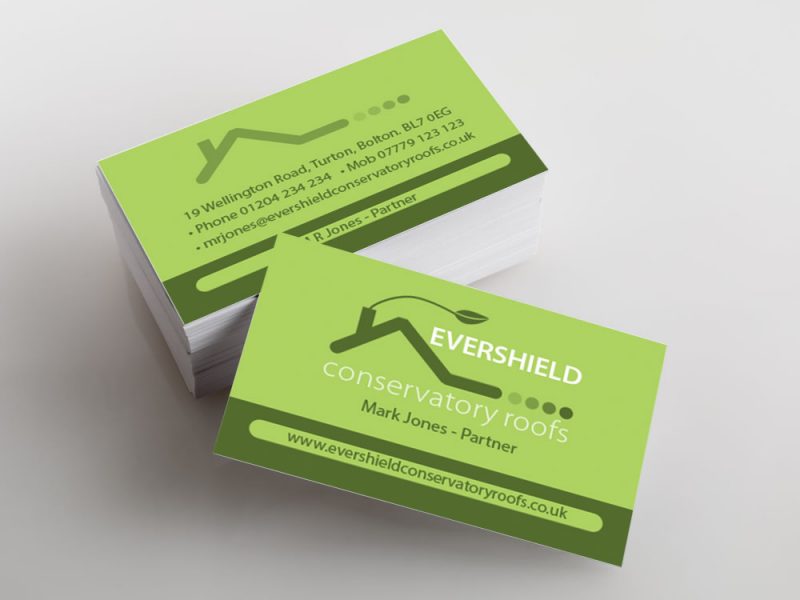
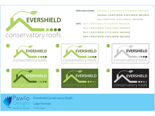
The use of green was a pre-requisite and so we embraced and maximised its impact. The main drawn element is deliberately clean and stylised to ensure comprehension.
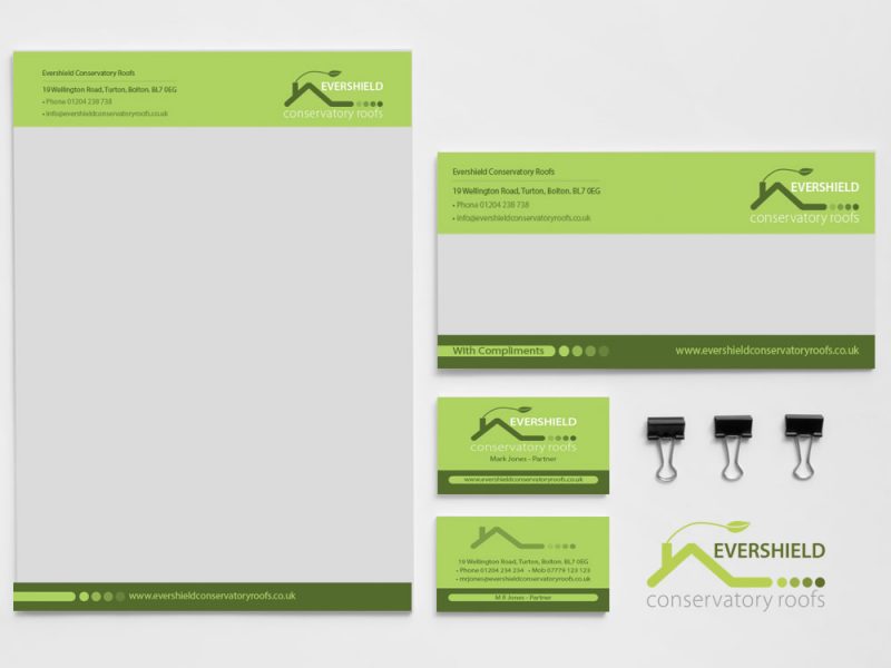
We extended the roof to the right to indicate the extension into the garden with the four dots blending away from the edge into the garden to accentuate the indoor/outdoor living and aspiration.
Results
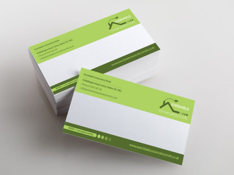
A clean two colour brand that reflects all core brand values applied to all corporate stationery.
The simplicity of the core logo and the formalised branding guidelines (and collateral) ensures that the brand can be applied consistently from the off across all future print and online resources.

