Design that get’s under the skin of your needs
A focused, inclusive design approach and delivery for web and print


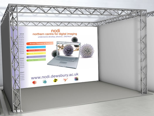
Northern Centre for Digital Imaging
We were asked to re-brand and reposition NCDI. The business was moving from public funded training to a more mixed commercial / public offer.
With this requirement we were tasked with moving the brand into this more corporate market.
Client:
Northern Centre for Digital Imaging
Location:
Dewsbury
Skills:
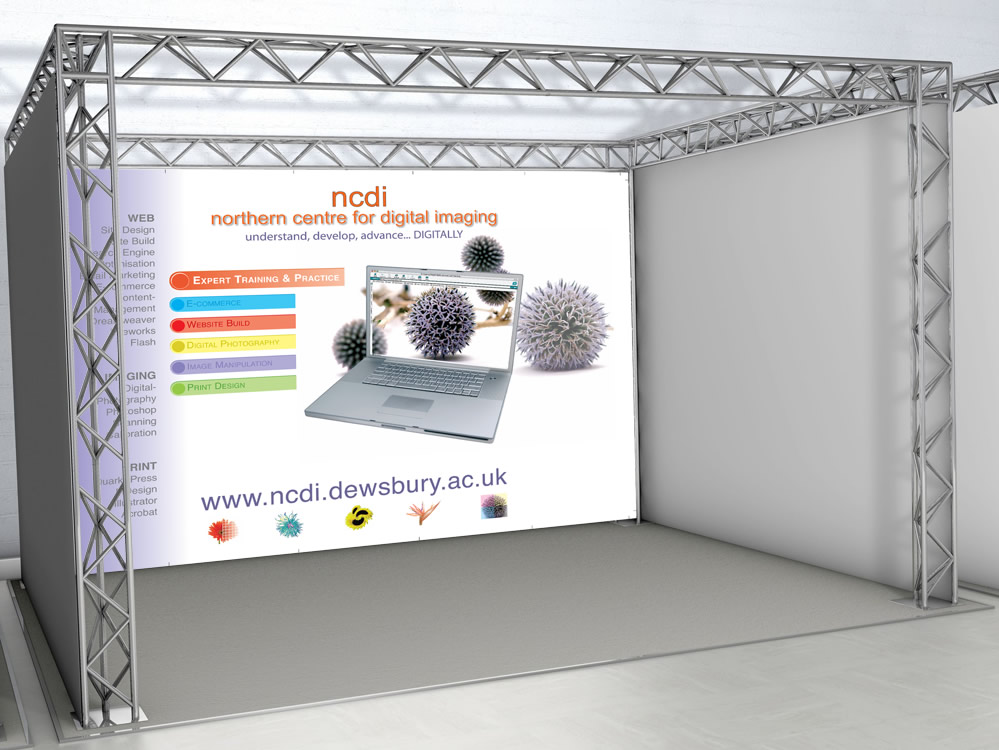
- Exhibition Design
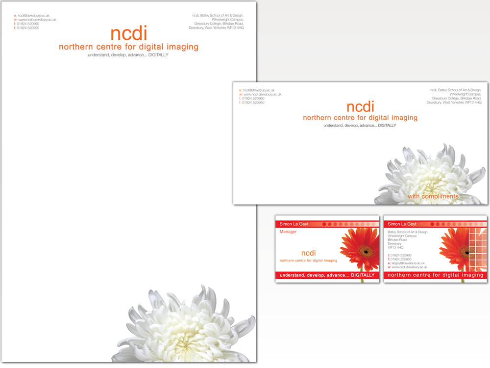
- Corporate Materials
- Brand Development
- Layout and Design
Approach
NCDI had been in operation for a number of years with an increasingly recognised brand.
As such we looked at the elements of the brand that were most clearly associated with the business and reapply them to place the business more effectively in the commercial market.
Solution
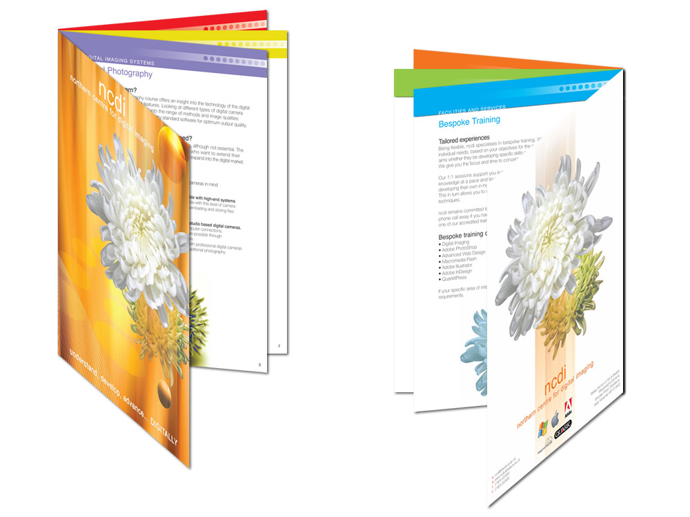
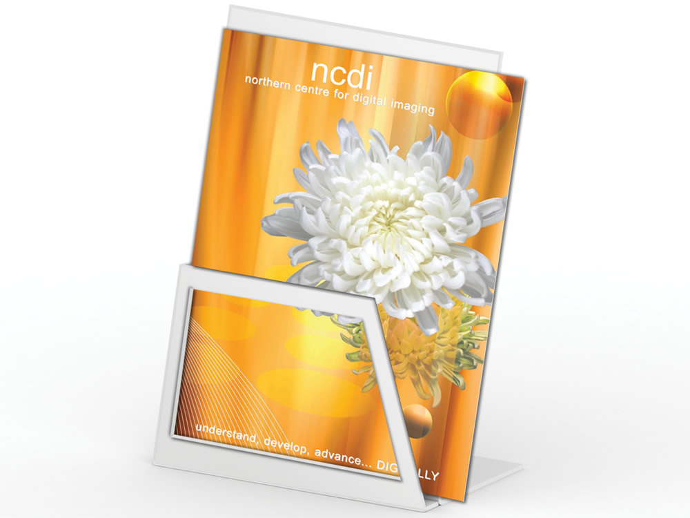
We worked with the existing flower element and corporate orange as a starting point.
Extending the metaphor we mixed this with a wider range of styled flowers and a co-ordinated colour pallet that would allow us to create distinct sub brands for the various elements of the business.
This approach then allowed us to illustrate the training offer digitally and in print.
Results
This has now been rolled out across all the marketing materials, exhibition panels, stationery and corporate materials required to promote and position the business.
The brand and all associated materials are now co-ordinated helping reinforce the brand with a clear and distinct set of collateral that allows easy and high quality resources to be created.
Related Work
SCC – Corporate Materials
GRAPHIC DESIGN
Concentrix – Corporate Materials
GRAPHIC DESIGN

Tex Services Brand Design
GRAPHIC DESIGN
NCDI – Corporate Materials
GRAPHIC DESIGN

Shakespeare – Corporate Design
GRAPHIC DESIGN
Inspire Rotherham Campaign
GRAPHIC DESIGN

MJCC – Corporate Materials
GRAPHIC DESIGN