Design that get’s under the skin of your needs
A focused, inclusive design approach and delivery for web and print
Phillip Dawson Plumbing
This is one of those projects you can’t wait to get your teeth into.
Our client required a start up branding exercise. As with all new businesses their priority was with doing the business.
All brands you wish to make an impact and be memorable and that was one of the main priorities for this particular assignment.
Client:
Phillip Dawson Plumbing
Location:
Halifax
Skills:
- Brand Design
- Brand Development
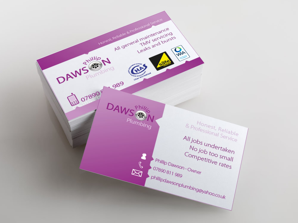
- Corporate Stationery Layout
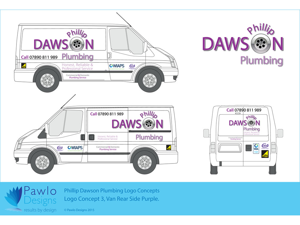
- Vehicle Graphics
Approach
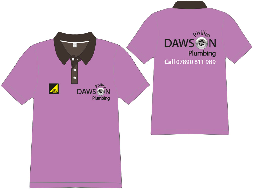
We were required to develop a memorable look and feel to their brand with a request to avoid the usual industry imagery or colours.
The brand had to work well on white as that element of cleanliness is important and the design had to be scalable to work with potential future sectors. So here we looked at the potential of using the O to represent other sectors going forward.
Solution
Key here was the name and industry and as such we made play on the O in Dawson. This left us room to adapt to other sectors as and when the business grows and develops.
To act as a contrast we also worked with a strong but none industry recognised colour pallet to provide an immediate differentiator.
Results
The result is a friendly and memorable brand that has flexibility and longevity.
Whilst we cannot take credit for their current full order book, we can say that we have helped Phillip Dawson Plumbing put their best face forward with confidence.